The curatorial and editorial project for systems, non-
©Copyright Patrick Morrissey and Clive Hancock All rights reserved.
Wendy Anderson: Odds and Evens
9 March – 1 April 2017, Eagle Gallery, London
Review by Laurence Noga
Stuart Davis’s Visa, painted in 1951, was based on a matchbook cover advertising spark plugs. The irony of that message, and its comment on America’s control of big business, was a deliberate strategy. Davis used the brand name ‘Champion’ combined with the phrase ‘amazing continuity’ to give the viewer a way in to a visual transformation, recognizing the chaos of everyday life in the urban sprawl.
Wendy Anderson’s solo exhibition ‘Odds and Evens’, at the Eagle Gallery, feels current and inspiring. Her work tunes in to Davis’s visual strategies, picking up on the chaos of the city, and her extensive global travel extends her authentic sense of process. The paintings push a heightened contrast, magnifying painterly strategies through the retrieval of information, and the constant building and dissembling of the surface facture.
Anderson’s research into the history of colour (such as Romanesque) leads her to
use earth-
Diebenkorn experimented with cigar boxes as supports, intuitively echoing the graphic structure of the lids in his larger works. With Anderson, the collage elements project slightly, adding a visual punch. The tickets and ephemera from her journeys feel buried beneath the more visible transparent or opaque uses of colour, creating a dialogue between inner state and physical action.
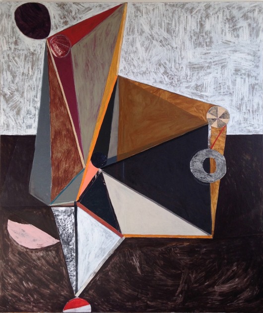
Balloon Block, 2015-
I immediately liked the way Anderson’s larger paintings, such as Balloon Block (2015-

San Francisco, 2016, mixed media on canvas, 60 x 46 cm
In San Francisco (2016) the grid structure of the painting announces 30,000 victims. This number might represent crimes of identity theft, or perhaps victims of earthquakes. We imagine Anderson pondering, on one of her many flights, whether an earthquake could cause California to sink below the sea. The simple rendering of the structure, reminiscent of the Universal Studios rotating globe, and painted in a muted warm grey, reminds us of Francis Picabia’s interest in mechanical forms. Yet Anderson’s preoccupations with painting and assembling make these intensely human works.
It’s interesting how Anderson interposes certain colours typical of Philip Guston’s
work into the surfaces and divisions within her compositional choices. Cadmium red
pigment is mixed with titanium white to give those pinkish fresco grounds and surface
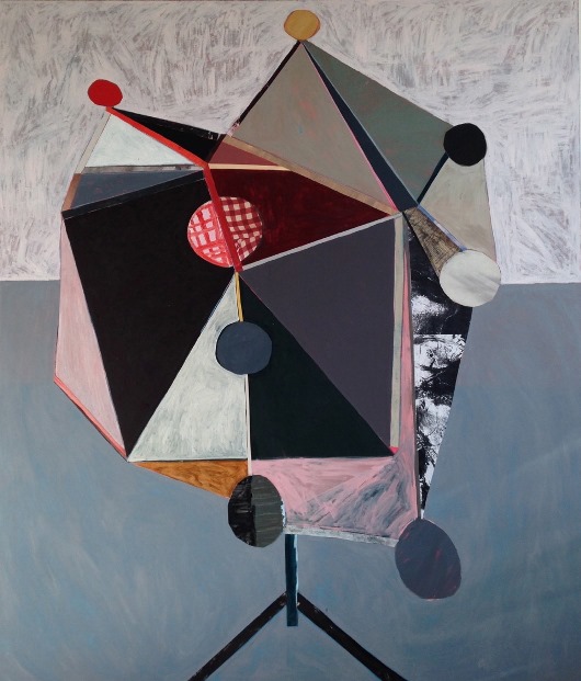
implications. In Balancing Act (2016) the form balances on a half-

That presence reminds me of the way in which the artist Victor Willing sets up his
picture space. For example, in Aha, so there you are (1980). Willing’s brush-
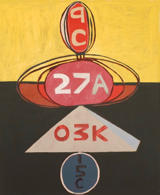
American Flights, 2014, oil and collage on canvas, 77 x 64 cm
In paintings like Flight 21F or American Flights, both made in 2014, that element of construction becomes much more frontal than in Willing’s work. The balancing of the sculptural shapes, and the impact of each set of numbers, is combined through close tone and close value adjustment. These shifts slide our perception towards an artist such as Prunella Clough, with her subtle pictorial dialect. The structural syntax of her composition between form and colour (spray, stencil collage, rubbing, drawing) is interwoven with phenomenological concerns.
At first glance, Anderson’s approach balances the surface/colour nuances with a constant
process of layering and re-

Hotel Almaty, 2014, oil and collage on canvas, 51 x 51 cm
Balancing Act, 2016, mixed media on canvas, 175 x 150cm
Flight 21F, 2014, oil and collage on canvas, 77 x 51 cm